- What do you need to improve the restaurant user experience on your website?
- Responsive design
- Fast server response time
- Easy to remember domain name
- SSL Certificate
- Must-haves for the best restaurant website UX
- Simple and intuitive design
- An attractive menu
- NAP information
- Online ordering system
- Testimonials or reviews
- How to get a highly optimized restaurant website by the end of the day
- Conclusion
Think of your restaurant website as your online location. You must ensure your visitors get the best restaurant user experience that will make them return just as they do in your physical location thanks to your décor, the friendly atmosphere, and highly trained staff.
You don’t have welcoming waiters online, but what you do have is technology. In this article, you will learn how to take advantage of technology and create the ultimate restaurant website experience.
What do you need to improve the restaurant user experience on your website?
A restaurant website that delivers a bad user experience will deter visitors from your business. They cannot try your delicious food if they have difficulty finding a menu and get frustrated with how long the site takes to load.
Therefore, if you want your website to convert visitors to clients, you must ensure it has the following features:
Responsive design
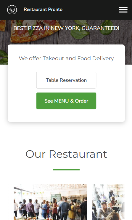
Nowadays, people access websites from all kinds of devices, whether desktops, tablets, or smartphones of different sizes. Because you want your business to reach a big audience, you must create a seamless restaurant website UX for any type of gadget.
In other words, the restaurant website design should adapt to the user’s screen size. For example, if you have a wide top banner where the Menu button is present, on the mobile version, the banner will shorten to keep the Menu button within easy reach.
This way, you provide a great restaurant user experience for every type of client without discriminating based on device usage.
Fast server response time
A website that loads very slowly can be infuriating in every industry. Not only does it take away precious time waiting for a page or item to load, but it also makes people not trust your business.
Now imagine a hungry customer who just wants to see your menu and order some food but has to wait 5 seconds before the menu loads. The moment a second passes, he will be tempted to close the window and find a new place to buy food that will fulfill his responsiveness needs.
Therefore, a website with a high loading speed is crucial for offering an amazing restaurant user experience that makes clients return for more.
Easy to remember domain name
You should establish a domain name for your restaurant’s website in the branding stage, where you decide what persona will appeal best to your audience. The best advice here is to keep it simple and use your restaurant’s name as the domain name.
You want people to be able to find your website fast and easily, not waste time trying to remember all the components. For example, “PizzaNona” is a good name, while “BestNeapolitanPizzainChicagoNona” is not.
SSL Certificate
To gain loyal customers, you need them to trust you and your website. Trust can be built by ensuring their data is protected whenever they browse your website and order your delicious food online.
An easy way to do this is to get your SSL (Secure Sockets Layer) certificate. This will prevent hackers from obtaining personal data from your clients, such as business or billing information.
Must-haves for the best restaurant website UX
To offer a top-notch restaurant user experience, your website can’t miss certain elements that make browsing easier and build trust with all visitors. Here’s what you must have:
Simple and intuitive design
A restaurant’s website is about food, and that should be obvious. You don’t need countless pages with stories and several pop-ups with offers that users must close to keep browsing.
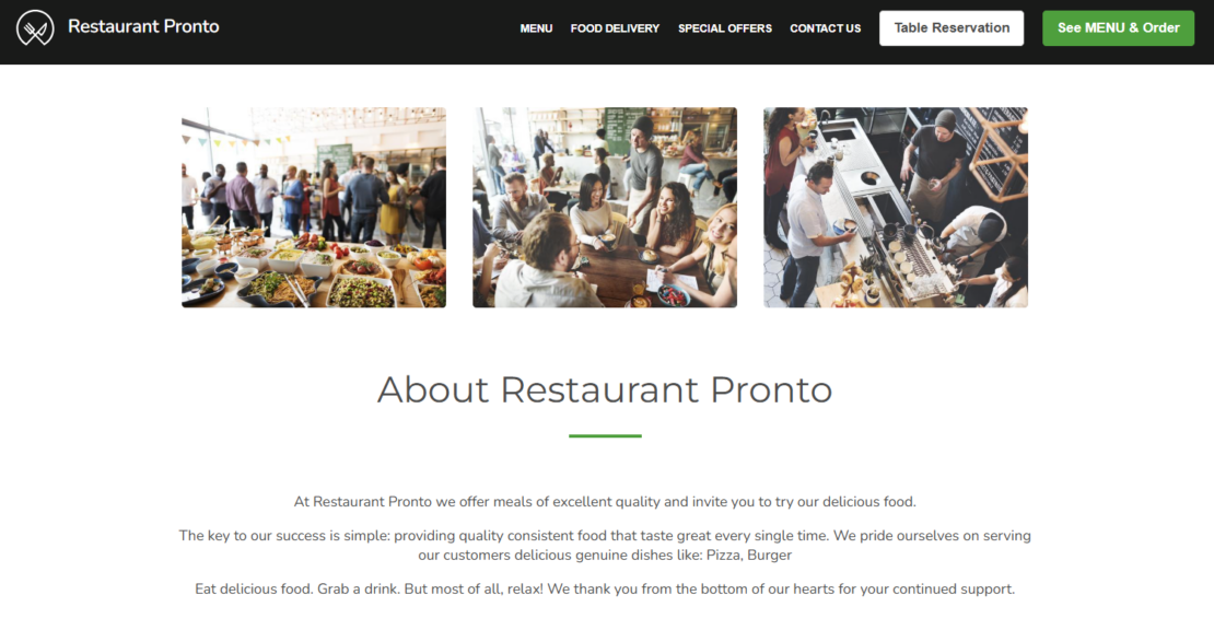
What you need is a simple UX design for a restaurant that is a pleasure to look at and encompasses all the key elements. The website must naturally lead the eye to the conversion item, the Menu button. Therefore, it should be placed in the top right corner and use a contrasting color to the background.
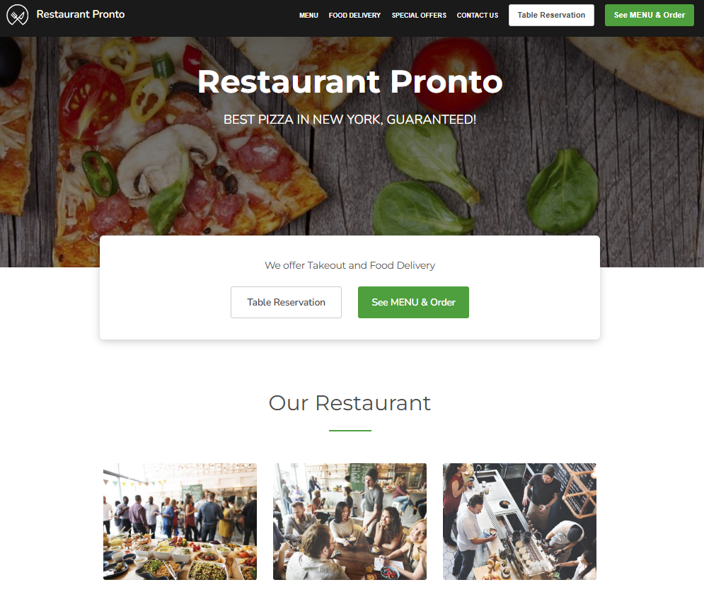
Your menu is your main selling point, so it should be immediately visible when opening your homepage. Choose a restaurant website builder that places your menu button in the top-right corner and uses a contrasting color to the background, so it stands out.
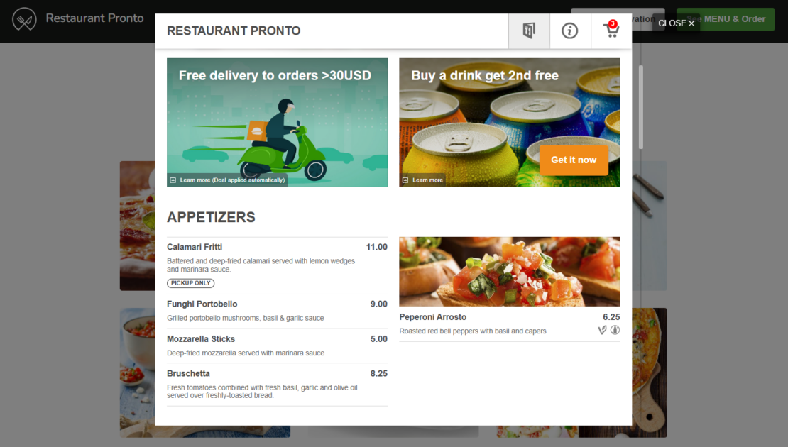
Moreover, your menu must be easy to use, so clients can quickly browse it and get to the check-out with no impediments. Our online ordering system can help you create an unforgettable menu that will attract more clients.
Check out this video to learn how easy it is to offer an unforgettable restaurant menu UX on your website:
NAP information
Adding NAP (Name, Address, Phone number) information to your website, social media, Google My Business, and local directories is an important part of SEO optimization. It also helps clients reach you easier, without having to dig for your exact location.
For that reason, ensure your “About us” section clearly lists your NAP information. You can also include a map, so potential clients get a better idea of where you are situated and if you deliver in their area.
Online ordering system
Why have a restaurant website just for presentation when you could have a money-making machine? Take your restaurant’s website UX to the next level and add an online ordering system to your website to start accepting online food orders in no time.
No need to empty your bank account. You can get an amazing online ordering system from GloriaFood for free. Here is what you must do:
- Sign up for an account;
- Fill in your restaurant’s information;
- Create an enticing menu that will encourage people to order;
- Publish our “See MENU & Order” button on your website and even on your social media;
- Download the order-taking app on Android or iOS;
- Start making money directly from your website!
Get more customers by offering the best restaurant user experience
Install an online ordering system to your website for free
But wait, this online ordering system can do much more! If you want to create the best restaurant user experience, you must allow your clients to make table reservations. And what better way to do them other than just pressing a button on your website?
Go to admin -> Setup -> Services & Opening hours -> Table reservation and copy the code we give you to your website to add the “Table Reservation” button next to the “See MENU & Order” one.
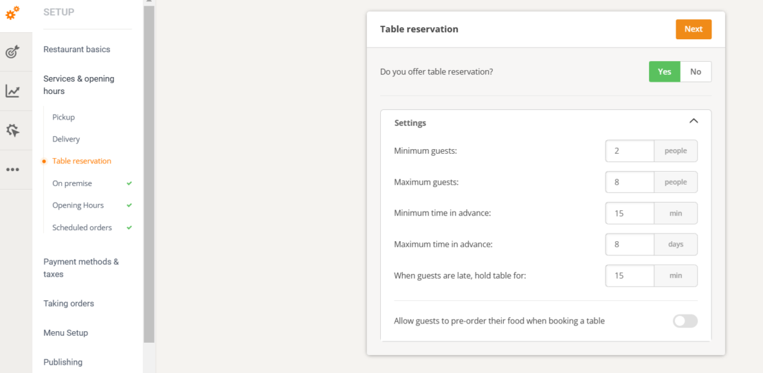
Click here to see a demo website and notice how well-positioned the buttons are. They are the first thing a client sees when they open the website. When they access the table reservation widget, a pop-up appears so they can easily choose their booking time.
Testimonials or reviews
People search for restaurant reviews before visiting or ordering from a new restaurant. They do so to ensure the services are as advertised and to find out how other people feel about your food and overall experience.
Why make them search for the review platforms you are on when you could include a testimonials section directly on your website? They will act like a stamp of approval, making other people trust your business.
How to get a highly optimized restaurant website by the end of the day
Now that you know how a great restaurant website UX should look, don’t worry, we also provide you with the solution. No need to start researching developers in your area. The answer can be easily found in our online ordering system.
You can get a sales-optimized website by going to admin -> Setup -> Publishing -> Sales Optimized Website and selecting “Yes”.
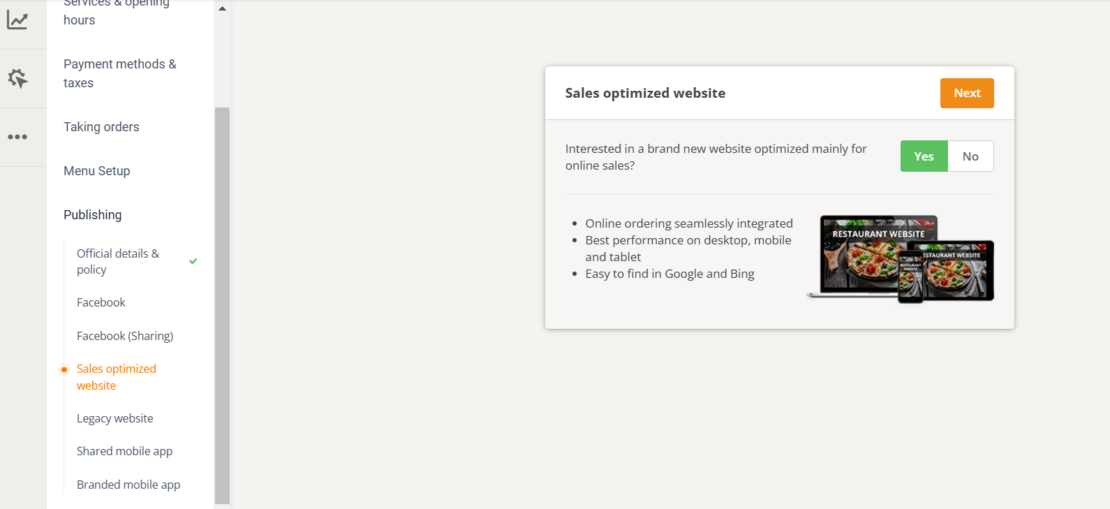
By just filling in your restaurant’s profile and creating your menu, you can get a customized website with keyword-rich texts that will help you rank high in Google searches.
The website offers the utmost restaurant user experience because it loads fast on every device, has a simple and intuitive one-page design, and includes an online ordering system that is easy to use and converts.
With our restaurant website builder, you can easily customize the sections by adding and moving around widgets with drag & drop. You can add a google map to your location, client testimonials, hiring announcements, and much more.
Pressed for time? Find out how you can build a restaurant website that includes all the features mentioned above in as little as 10 mins from this video.

Create a top-notch restaurant user experience with an easy website builder
Go live by tonight with little effort
Conclusion
If you want to attract more customers and turn your website into a money-making machine, you must ensure you offer a top-notch restaurant user experience.
You can do so by requesting a sales-optimized website from our online ordering system. No more stress, just conversions delivered by a responsive and intuitively designed restaurant online location.
- What do you need to improve the restaurant user experience on your website?
- Responsive design
- Fast server response time
- Easy to remember domain name
- SSL Certificate
- Must-haves for the best restaurant website UX
- Simple and intuitive design
- An attractive menu
- NAP information
- Online ordering system
- Testimonials or reviews
- How to get a highly optimized restaurant website by the end of the day
- Conclusion
