- Why you should use flyers at your restaurant
- How to make a restaurant flyer in just a few minutes
- 10 restaurant flyer ideas that work
- Use vibrant colors
- Keep copy short, fun and inspiring
- Use space dividers
- Craft a great design for your target audience
- Give out the right signals
- Appeal to senses
- Focus and showcase
- Use visual hierarchy to highlight what you want customers to read first
- Use special paper
- Choose a winning template for your restaurant flyer ideas
- Resources to Help You Create a Restaurant Flyer
- Final Words
A restaurant flyer is your silent brand ambassador even before the client sees your menu, venue, or website. That is why the design of this small piece of paper or digital real estate is crucial for the profit of your restaurant.
Flyers are a communication vehicle for your brand that can do wonders for awareness. You can also use them to attract new clients or be top-of-mind for existing patrons. They are cheap, easy to make, and you can change them as often as you want.
In this article, you will find a variety of restaurant flyer ideas and a simple guide for creating your own in just a few seconds:
Why you should use flyers at your restaurant
Using restaurant flyer ideas to promote your restaurant is one of the oldest marketing techniques for a good reason: because it works. Here are the advantages you will enjoy if you start sharing flyers:
- You can reach offline markets: expand your audience to people who don’t usually look for restaurant content online;
- Low cost and high return: you only invest in the printing cost and you can attract a variety of new clients with your irresistible promotions;
- 79% of consumers keep flyers after they receive them: maybe they are not hungry when they receive your flyer, but they will surely remember they have a coupon for 10% off when they crave a pizza.
How to make a restaurant flyer in just a few minutes
To create a restaurant flyer that brings you new clients, you require the right tool. Lucky for you, we have exactly what you need. Our online ordering system is equipped with the Flyers feature that helps market your business efficiently.
Sign up for a free account, fill in your restaurant information, and let’s learn how to create a promotional flyer in almost no time:
Attract more customers with our unbeatable restaurant flyer ideas
Create a flyer and send it to print in just a few seconds
Go to admin -> Marketing Tools -> Flyers -> Your flyers.

Then click on the “Add flyer” button and choose the type of flyer that best suits your needs.
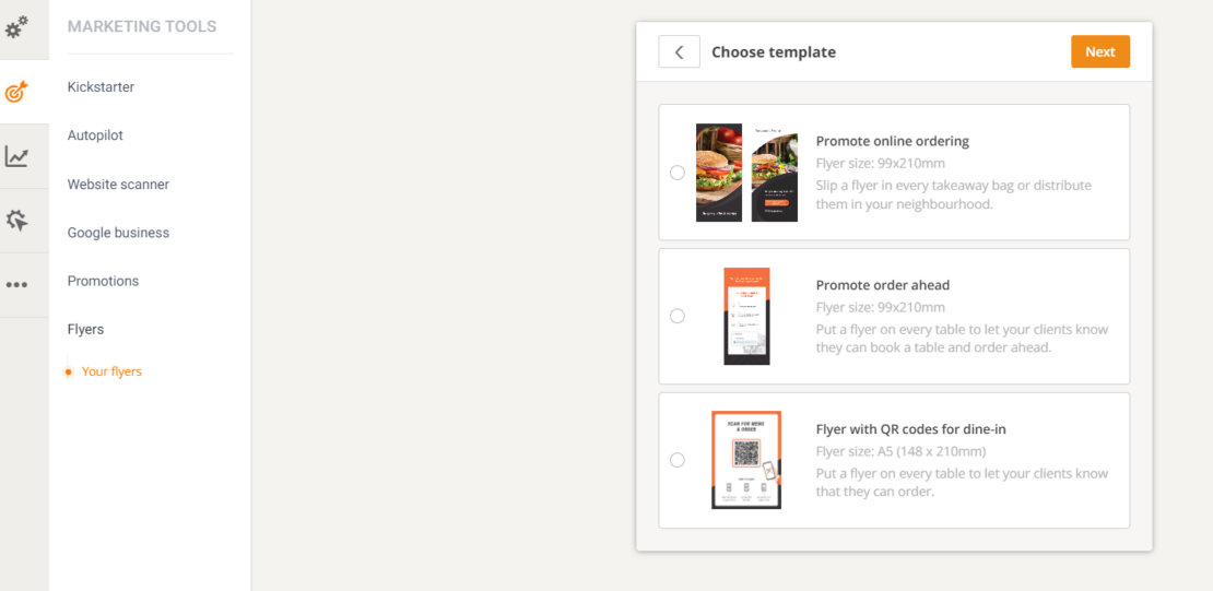
You can choose between three types of flyers:
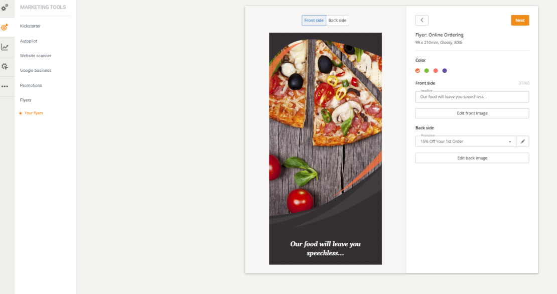
- Online ordering flyer: access a restaurant flyer template that includes a promotion to encourage people to order your food online. For example, free delivery or 5% percent off main dishes. You can include the flyers in the delivery bags or distribute them in your delivery zones to attract more clients;
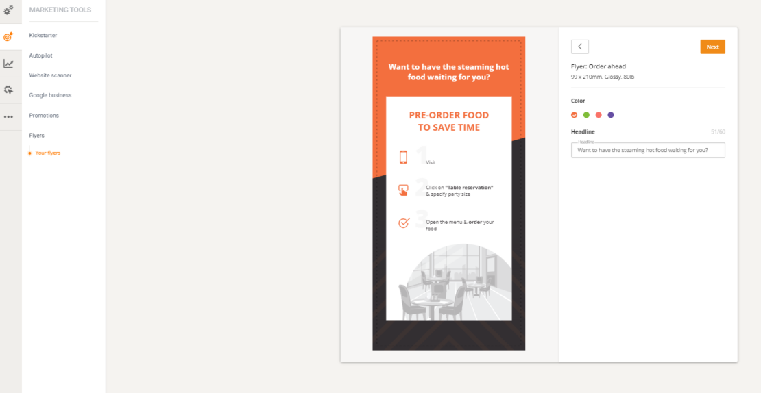
- Order ahead flyer: our online ordering system allows you to accept reservation with ordering ahead to increase table turnover and customer satisfaction. Enable this useful feature by going to admin -> Setup -> Services & Opening hours -> Table reservation and checking the box next to the text “Allow guests to pre-order their food when booking a table”. Now you can promote this new aspect by creating a food restaurant flyer, printing it, and adding it to your tables.
- QR code ordering flyer. You can allow people to order your dishes in the restaurant with just a few clicks on their phone. All you have to do is generate a QR code restaurant menu and print it on a flyer. Afterward, place a flyer on each table for easy scanning.
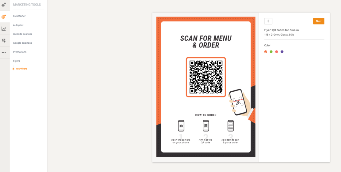
Check out this video to learn how to generate a QR code restaurant menu in no time:
Click yes on the restaurant flyer design of your choosing and then click “Next” to go to the customization screen. Here, you can add a mouth-watering picture of your food, adjust the colors to match your restaurant branding and edit the headline text.
Click on “Edit back image” to add a hunger-inducing picture to the back of your flyer. There is just one more step before you can send your food flyer design to print: creating the coupon codes that will appear on the flyer and encourage people to order.
Create attractive restaurant flyers in minutes
Use our online ordering system for fast results
To do so, go to admin -> Marketing -> Promotions -> Self-made promos -> Add promo deal and choose any of the available deals you want your clients to redeem with the flyer.
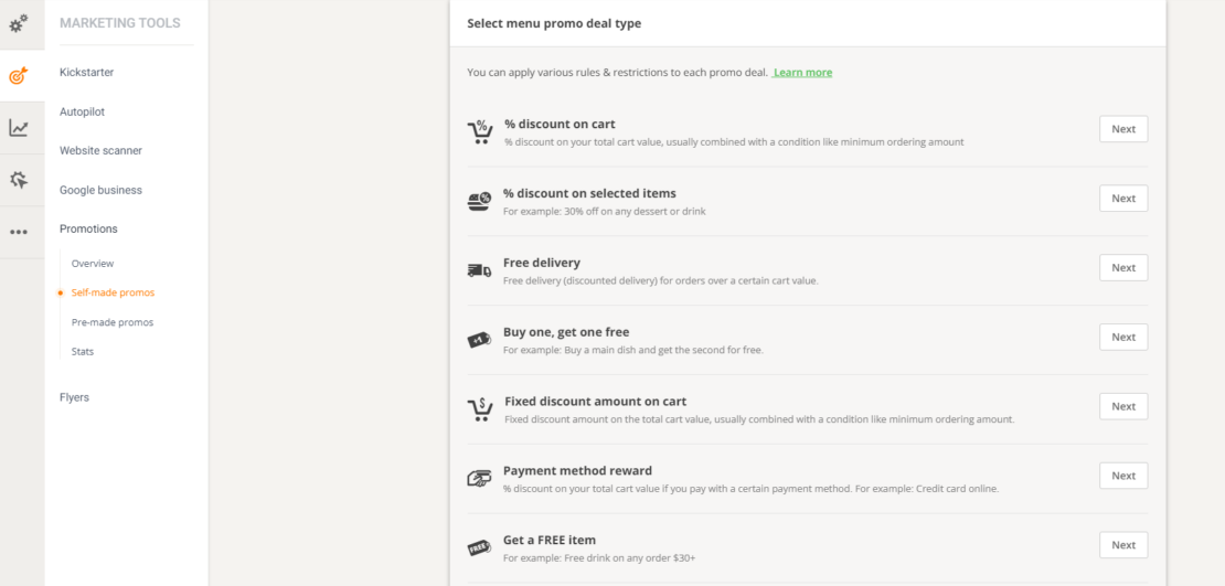
Click on “Next” on the following two screens and fill in the important information such as minimum order amount or headline. By clicking “Next” again you will reach a screen where you must check the box near “Use custom coupon code”.
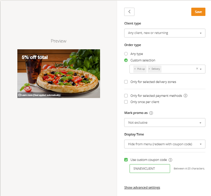
Don’t forget to also select “Hide from the menu (redeem with coupon code)” from the Display Time section. Add the coupon text clients will use to get the discount, such as “5%NEWCLIENT” or “30%BF”. Click save and you’re all done.
If you want to learn more about how to create restaurant coupon codes, check out this video:
Now let’s get back to our flyer. All there is left to do is add the coupon text and click on “Next”. In this last screen you can choose your preferred method of printing:
- Download: get the restaurant flyer transferred to your computer and print it on your own;
- Send to print: email the restaurant flyer design directly to your print shop so they can help you.

That’s it! Have fun creating attractive restaurant flyers that will bring you more clients and increase your revenue.
10 Restaurant Flyer Ideas That Work
On top of the above restaurant flyer ideas that are focused on increasing conversion, you can also create flyers in other programs for a variety of reasons:
- Holiday offers: organizing a special dinner for Valentine’s, Thanksgiving, or Christmas? Let your clients know by designing an appropriately themed flyer for your restaurant;
- Corporate parties: if your location is open to host company parties, be sure to let potential patrons know this. Distribute the flyers in office buildings and even at subway stations near office districts.
- New menu: every time you introduce new items to your menu or go through a seasonal change, don’t just assume people will notice it. Create a flyer to let them know. Also, use the digital version as part of a newsletter.
- Deals: Attract clients to your restaurant by offering them hard-to-pass deals like 20-50% off your most popular items or a daily menu for a fixed price.
- Happy Hour: make sure you attract clients as soon as they leave work by creating a special offer after 6 PM.
- Themed Nights: a flyer can be an effective way to advertise an exclusive night, like a live music act taking place in your restaurant or a wine-tasting event. You can also think about food-centric nights like Sushi Night, Oyster Dinner, or Taco Tuesdays.
- Live cooking: if your kitchen set-up allows it, you can have live cooking nights, where patrons get to see your chef in action and maybe get some tips and tricks to try at home.
Here are some tips to ensure your flyers are persuasive:
1. Use vibrant colors
Food is all about colors and textures that make people feel intrigued and hungry. Your flyer needs to be as tempting as a hot pizza slice and as hard to forget as the taste of cheesecake.
You can show the finished product or focus on the freshness of the ingredients. Make sure to separate the different visual areas with some white or negative space, so that it doesn’t become crowded and each dish gets a chance to shine.
2. Keep copy short, fun and inspiring
Apart from the contact details, you only need a call to action and some inspirational words on your flyer. Everything else should be on your website.
If you decide to share a part of the menu, select a few dishes. By no means use a restaurant flyer as a menu replacement.
Focus on high-value items and the stars of your cuisine.
Use attention-grabbing words like free, new, save, love, and other positive expressions, together with the names of the dishes.
3. Use space dividers
Think of your flyer as an excerpt from a newspaper or a movie poster. Use columns and rows to separate ideas and offers. Use different colors and backgrounds to highlight information in an eye-popping way.
4. Craft a great design for your target audience
Think about your audience. Who are these people? How old are they? What do they like the most? How can you strike a sensitive chord with them? Try and create a visualization of your current client base. Segment them by age, interests, and the food they order most often. Then, try to identify the most profitable segments and the underserved ones. These, and those similar to them, are the people you are trying to persuade.
Create restaurant flyers that have smart references to what your clients might find interesting, funny, or could feel nostalgic about. Use fonts and visual cues to link your message to their preferences.
5. Give out the right signals
The design of your flyer can give subtle cues about your restaurant. If you have an upscale place, you will need to show that by using a neutral color scheme that embraces minimalism. On the other hand, if you have a crowded burger joint, you can go crazy and use multiple images and colors on your flyer.
Here are a few examples from a website offering flyer design templates for restaurants.
6. Appeal to senses
Your goal is to make the customers as hungry as you can so that they spend more. The easiest way to do so is to trigger their senses in the most primitive form. Use mouth-watering images or even videos. This sample of a fiery banner makes people think about a juicy steak or burger immediately; you can almost feel the charred smell before clicking it.
The best images you can use for this are “in the process.” Use a picture of wine being poured into a glass and put a freshly sliced pizza next to it. Use dynamic visuals and show food texture instead of perfectly arranged plates. Aim to make the recipient of the flyer imagine that they are already savoring the dishes you show them.
7. Focus and showcase
Think about your flyer as a shop-window of your menu. You don’t put everything in there. Make a seasonal selection of your top offerings. When it comes to cost, make sure you use nested prices, which come after the description and use the same size font. Don’t allow people to select based on the price tag, but on what you have to offer – eradicate currency signs.
8. Use visual hierarchy to highlight what you want customers to read first
There are a few simple principles of visual hierarchy that can help you create an eye-catching flyer. The goal of this concept is to answer three questions: What is this? How do I use it? Why should I care?
Make sure you put the name of the event you are advertising with a clear, easy to read, and large enough font. You want to let people know what you are talking about right away. Next, use the same, or coordinated fonts in a smaller size to give more details like the type of event, the menu or the theme.
Use contrasting fonts or logos to emphasize information like the name of the invited band or a sponsor. This structure will help the people reading the flyer diagonally to decide if this is interesting for them.
Don’t forget to put your contact details for reservations or further questions in a corner or centrally, at the bottom of the flyer.
9. Use special paper
If you want to use a simple flyer design and make an impact, you could use special paper. Select colorful pages and print with contrasting colors. Another option is to use heavier paper and rely on texture and a premium feel, although this could be too expensive.
10. Choose a winning template for your restaurant flyer ideas
When selecting a template, you have to pay attention to five items: background, color scheme, fonts, image proportion, and overall feeling.
The background for a restaurant flyer should be either monochrome to highlight the food illustrations or have a texture that reminds of natural materials used in the kitchen, like woodchoppers or stone tabletops. There is a growing trend of using a chalkboard background for the contrast, but it is becoming overused. Photos of your restaurant or a lovely table setting can also work unless they are making the flyer too complicated. Try to stick to a simple design for your restaurant flyer. Less is more.
Although you need to keep text to a minimum, fonts are essential. You need to select a combination of maximum two complimentary typefaces which are in line with your brand, logo and other written communication, like the menu.
The color scheme doesn’t have to follow precisely that of your logo or branding; it can be adjusted to the event. Since you are dealing with food, use food-related colors that are known to make people hungry. Neuromarketing research shows that food sales are greatly influenced by color. It is best to keep away from blue tones unless they are used for décor.
Resources to Help You Create a Restaurant Flyer
Now that you have some inspiration and strategy, it’s time to create a flyer that will be hard to resist for your patrons. For the best restaurant flyer designs, we advise you to use existing template services. Most online tools will give you excellent templates and are also very cost-effective compared to a graphic designer. Some of the best websites for designing restaurant flyers are:
After you have selected a tool you feel comfortable with; it is time to create your restaurant flyer design.
Using a digital drawing tool, you can easily plan and design your flyer to make a lasting impression on potential customers.
You can also find lots of inspiration if you follow our Pinterest account, where we have a special GloriaFood Board with hundreds of flyer designs for restaurants. Use these as a starting point or select a few of them on your board and show them to your designer.
Final Words
Remember that flyers are a way to keep your marketing fresh and up to date. They show your patrons and potential clients that you are always thinking about bringing something new to the table.
If you are just getting into the business, design a restaurant opening flyer to tell people you are ready to receive guests.
Or you can simply use our restaurant ordering system which comes with a great Marketing module and tried-and-tested restaurant flyer ideas, as well. This way, you can design your restaurant flyers faster than you can say “blueberry pie”.
- Why you should use flyers at your restaurant
- How to make a restaurant flyer in just a few minutes
- 10 restaurant flyer ideas that work
- Use vibrant colors
- Keep copy short, fun and inspiring
- Use space dividers
- Craft a great design for your target audience
- Give out the right signals
- Appeal to senses
- Focus and showcase
- Use visual hierarchy to highlight what you want customers to read first
- Use special paper
- Choose a winning template for your restaurant flyer ideas
- Resources to Help You Create a Restaurant Flyer
- Final Words
