- What is a call to action for a restaurant?
- Where you should use a restaurant call to action:
- Online ordering menu button
- About us section on the restaurant website
- Banners on the restaurant website
- Bio on social media
- Social media captions
- Email marketing campaign
- How to write a strong call to action for your restaurant + examples
- 1. Keep it short
- 2. Make use of the imperative
- 3. Don’t promise more than you can offer
- 4. Make it a limited-time offer
- 5. Use design to make the CTA pop
To ensure your restaurant’s success, you must invest a lot of time and effort in marketing. And for your marketing strategies to work, you need to use a powerful restaurant call to action as often as possible.
A powerful call to action can be the only difference between an OK marketing campaign and an amazing one that converts a big number of visitors to clients.
In this article, you will find out how to write a killer restaurant call to action (with examples) and where you should place it for the best results.
What is a call to action for a restaurant?
A call to action for a restaurant (often referred to as CTA, for short) is a button or sentence that encourages the viewer to take a certain action. For example, to open the menu, to order a specific dish, or to take advantage of a promotion.
In other words, by using a CTA, you give people clear instructions using direct language. You show indecisive potential customers where they should click and what they should do, increasing the conversion rate as a result.
Where you should use a restaurant call to action
Keep people engaged and prevent them from leaving your restaurant’s website or social media channels by using decisive CTAs in key places. Here are a few examples:
It should come as no surprise that you need an online ordering system to increase your revenue. But how can you let people know they can order using an intuitive menu in just a few minutes? With a restaurant call to action.
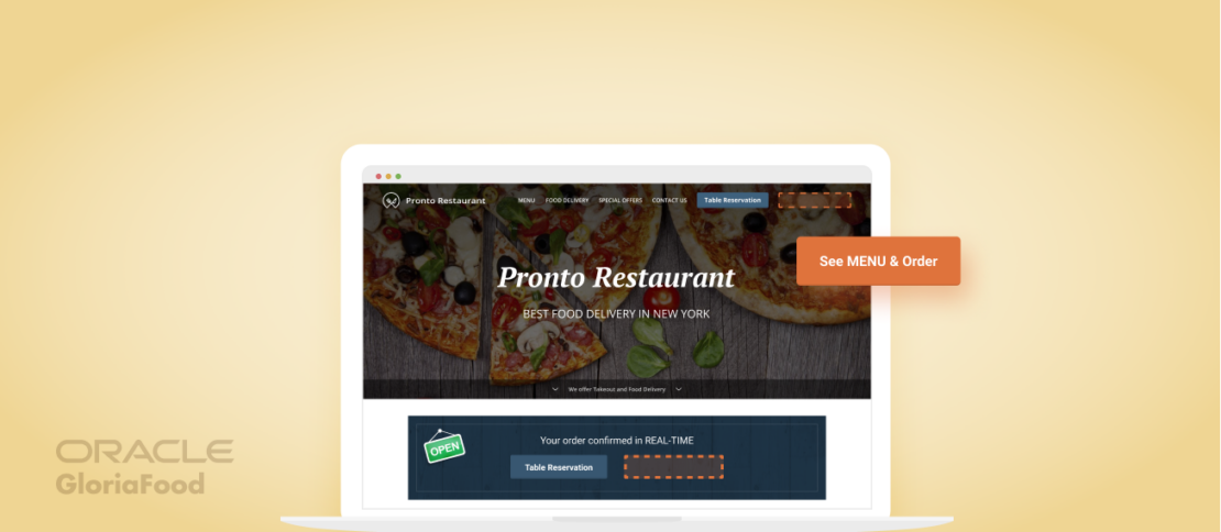
The good news is, if you use the online ordering system from GloriaFood, there is no need to start brainstorming for a menu button CTA. We’ve already come up with a call to action that converts: See Menu & Order.
If you want to start taking online orders by the end of the day, follow these simple steps:
- Create a GloriaFood account and fill in your restaurant’s information;
- Create an attractive menu with your delicious dishes;
- Publish the menu button in a visible place on your website, so clients can see the CTA;
- Download the order-taking app on iOS or Android;
- Start benefiting from the power of great CTAs and accept online orders.
You don’t have a website? No problem, we can help you with that as well. Go to admin -> Setup -> Publishing -> Sales-optimized website and request a customized restaurant website that delivers a top-notch restaurant user experience.
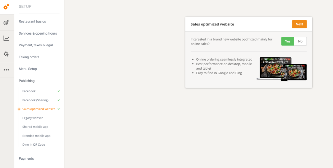
Not only will we deliver an already SEO-optimized website, full of mouth-watering pictures and enticing text, but we’ll also make the Menu button the star.
Attract customers with a great call to action menu button
Get your sales-optimized restaurant website now
Click here to see a demo website where the Menu button is the first thing you look at because of its position above the fold, contrasting color, and, of course, strong CTA.
About us section on the restaurant website
The “About us” section is a great way to tell people what makes your restaurant special: your story, your ingredients, your location, your mode of preparation, etc. But it is also a great opportunity to use a restaurant call to action.
Here is what you can do:
- Add the menu button here, as well as above the fold. Maybe a visitor gets hungry after reading your description and they want to see what you offer;
- Insert “Visit our restaurant!” naturally in the text. This CTA will pair well with a convincing description and photos of how great your restaurant’s interior looks.
- Include dish-specific CTAs, such as “Try Nona’s special pizza!” or “Don’t miss out on the famous chorizo lasagna!”
Banners on the restaurant website
A banner will already pop out from the restaurant’s website background, so don’t waste the space on a monotone, easy-to-ignore sentence. Instead, create an informative text and end it with a strong restaurant call to action.
Here are some ideas:
- New menu item launch: “Be one of the first people to taste the amazing carbonara by Chef Giorgio!” or “Order your pizza amatriciana now! Fast, before we run out!”
- Encourage online ordering: “Order your lunch wherever you are in a matter of seconds!” or “Discover how easy it is to order your favorite dishes online!”
- Advertise a promotion: “Don’t miss out on your chance to get a free dessert with every order!” or “Buy one hamburger and get one free for your friend. Place the order now!”
Each of your social media accounts should have a complete bio that encourages your followers to become clients. The main rule is that it must be brief as people’s short attention span will determine them to just scan the text and not take the time to read a long story.
Here are the main things a restaurant’s bio on social media should include:
- Link to the website: or directly to the menu if you use our online ordering system;
- Location: ideally with a link to Google Maps, so clients can see exactly where you are located;
- Working hours: don’t make clients waste their time trying to find out when you are open. Have your working hours visible on every platform;
- Unique Selling Proposition: advertise what makes your restaurant special in just a few words;
- CTA: Encourage people to become clients by including a powerful restaurant call to action, such as “Order now and take your taste buds on an adventure!”.
Social media captions
As opposed to a call to action used for a button, social media captions allow you to experiment with different phrasing, length, and even punctuation marks. Who says every CTA should end with an exclamation point?
“Leave us a comment below with your favorite menu item” or “How many of our dishes have you tried?” still fall in the CTA category because they convince people to take action.
Never write a restaurant social media caption without a call to action. Instead, try to emphasize the benefits potential clients will get if they choose to listen to the CTA.
Email marketing campaign
Email marketing campaigns are a great way to get loyal customers by constantly informing them about your news, promotions, etc.
Every email you send out should include a restaurant call to action that encourages people to either order again, try a new menu item, take advantage of a promotion, or another action that increases your sales.
If you don’t want to spend your time coming up with ideas and sending countless emails, we have the perfect email marketing solution for you: GloriaFood’s Autopilot module.
Get more repeat customers with efficient email marketing campaigns
Install our free online ordering system and get started
With Autopilot, you set up your campaign once and the rest will be sent on autopilot. The module segments clients according to their purchasing history to send them relevant campaigns. You can focus on other important aspects of your restaurant while getting more repeat customers every day.
To get it, go to admin -> Autopilot Selling -> Autopilot:

Learn more about how to increase restaurant sales, promote food offers and keep customers engaged with our Autopilot module:
How to write a strong call to action for your restaurant + examples
Now that you know what a restaurant call to action is and where to use it, let’s get to the fun part: writing it. We’ll give you the secret ingredients for creating a CTA that converts every time.
1. Keep it short
We see the trend of decreased attention span every day. People prefer watching a short video for entertainment, rather than reading a long article. No matter the reason for this change, you must give clients what they want: a short sentence.
Limit yourself to about two-three words when you write a CTA for a button. For banners and social media where there is more text, you can go for a longer CTA, but don’t forget to make the desired action clear.
Here are some examples of CTAs for restaurant reservations:
- Book a table!
- Make a reservation!
- Book your table now!
- Reserve a table online!
- Don’t forget to reserve a table for our Sunday Ramen! There are a limited number of tables.
2. Make use of the imperative
You should start every restaurant call to action with an imperative to convince people to do as you instruct them. Strong action verbs such as “order”, “buy”, and “visit” will direct people to your desired outcome.
If you have the space, try to add a benefit or another reason for them to abide by your CTA. For example, “Order now and get free delivery for every order over $40!” tells people they will enjoy the benefit of free delivery if they take the action of ordering.
Check out these call to action copy examples:
- Discover our location!
- Explore our menu!
- See our specials!
- Check out our selection of beers!
- Tell us what your favorite dessert is in the comments for a chance to win a free meal for two!
3. Don't promise more than you can offer
We’ve talked about mentioning a reason or adding a benefit in the CTA. But it is important to not go overboard and make promises you can’t uphold. For example, if you use this call to action “Place an order today and get 30% off any pizza!”, the offer should be available immediately and for every pizza on the menu.
If you have a more expensive pizza that the offer doesn’t apply for, people will notice you lied and you risk receiving bad reviews that will be hard to recover from. Therefore, ensure you are always transparent about what you promise.
4. Make it a limited-time offer
The FOMO – fear of missing out technique is being used in all industries to sell a product. Clients will be more prone to ordering from your restaurant if a promotion is only available for a day, or if there is a limited number of desserts or tables available for a food event.
Thus, try to create a sense of urgency with your CTA. Here are a few examples of FOMO-inducing restaurant calls to action:
- Order now for the last chance to try Chef Onoa’s lasagna!
- Visit our restaurant for a chance to taste our famous gumbo! Traditional recipe, only available today.
- Get a free dessert for every order placed before 8 p.m.
5. Use design to make the CTA pop
You can write the best restaurant call to action possible, but if the design isn’t good, it will go unnoticed. There are a few tricks that can help a button stand out:
- Use a contrasting color: for example, if the background is black, create a white button. You need it to attract attention when a potential customer opens the page;
- Use a bigger font size: if the writing is bigger than the text around it, your eyes will be immediately drawn to it;
- Use an easy-to-read font: creativity is great, but you should focus on readability for the CTA. Opt for a simple font with no lines, flowers, or other elements that take away from the message.
- Position the CTA in a visible place: for example, a menu button will be easy to spot if it is above the fold.
Conclusion
Having a powerful restaurant call to action in key places on your channels, such as a menu button on the website or social media bio, will help you convert more visitors into clients. Use strong action words, and offer a reason for customers to do the desired action. Also, don’t forget about the importance of design.
- What is a call to action for a restaurant?
- Where you should use a restaurant call to action:
- Online ordering menu button
- About us section on the restaurant website
- Banners on the restaurant website
- Bio on social media
- Social media captions
- Email marketing campaign
- How to write a strong call to action for your restaurant + examples
- 1. Keep it short
- 2. Make use of the imperative
- 3. Don’t promise more than you can offer
- 4. Make it a limited-time offer
- 5. Use design to make the CTA pop
