- Why does it matter so much where you place the order online button?
- Where should you add the order online button? (Visual Instructions)
- How to add the order online button on your restaurant website
- Sell more by adding our order online button on your website
- Customizing your order online button
- Wrap up
If you want to build an online ordering website for your restaurant, the first thing you need is a visible and strategically placed order online button. From our experience talking to thousands of restaurants and monitoring their progress, a button added in the wrong place can significantly decrease your chances of getting online orders. The same goes for one that doesn’t draw enough attention.
Below, we teach you how to make a food ordering website that stands out by giving the customer exactly what they want: an easy-to-spot order online button.
Here’s the first thing you should know about online food ordering: customers don’t have the patience to search your website to find the order online button. Online food ordering websites should live up to their promise: provide an easy solution for people who want to order food online.
Especially when customers are hungry, they won’t be interested in reading a long story about the history of your restaurant. That is not to say you shouldn’t have one. Details like these make your restaurant more authentic and accessible. However, they should never overtake your most important goal: sales generation or, in other words, getting people to order food from you online.
How to take food orders online while creating a great customer experience? The best solution, in this case, is an easy one: make the order online button visible at all times, and prioritize the homepage.
The most important place where you need to display the online ordering button is on your homepage. That is the first thing people see when they visit your website. If they’re already on your website, they most likely want to place an order, so don’t make them search for the ordering button.
The home page for an online food ordering system must feature an immediately noticeable order online button that will encourage people to buy your food.
Place it above the fold so they can see it first. A lot of customers don’t usually scroll down, so if you place the button at the bottom of the page, they might not even bother to check there. As a result, they might close the page and look for a different restaurant.
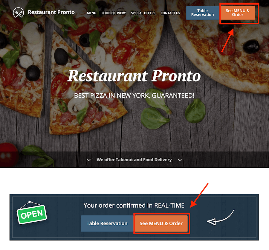
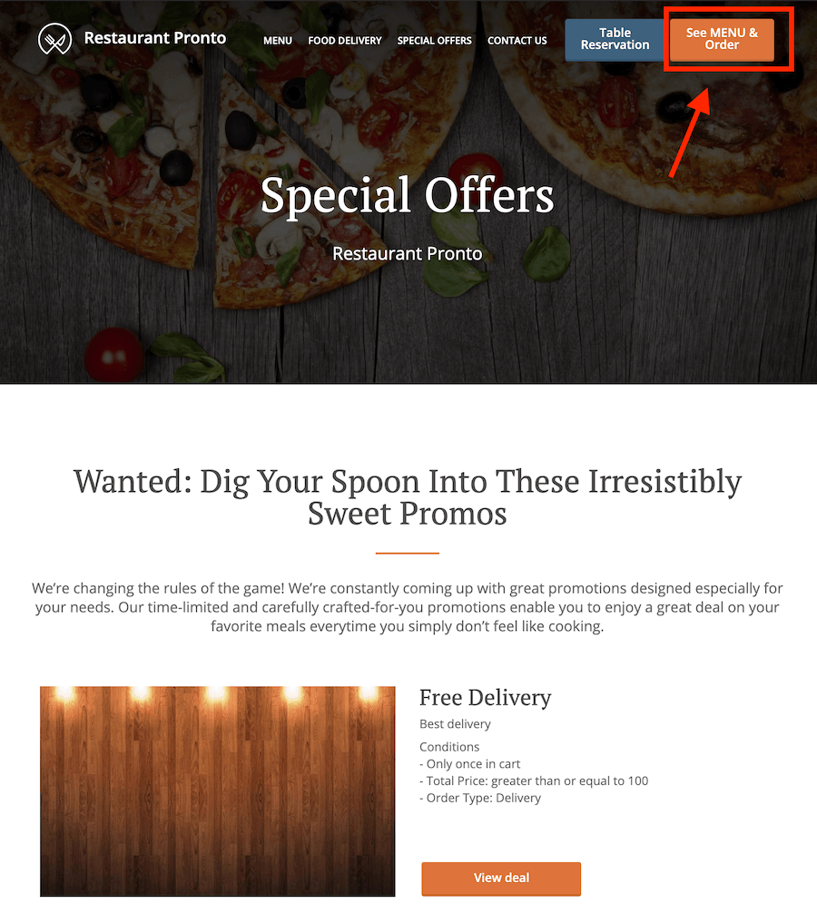
Apart from the homepage, we also recommend displaying the order online button on the rest of your pages (such as contact page or special offers page). While this is not as important, it will still act as a visual stimulus that might convince people to order. That way, wherever they may be on your website, they can easily place an order with the click (or tap) of a button.
The best type of online ordering button is a sticky one. What does a sticky button do? It “follows” the user as they scroll up and down the page. That way, the button is always in sight and easy to click. Ideally, place it in the website header. Here is an example from our demo website, pronto-ny.com.
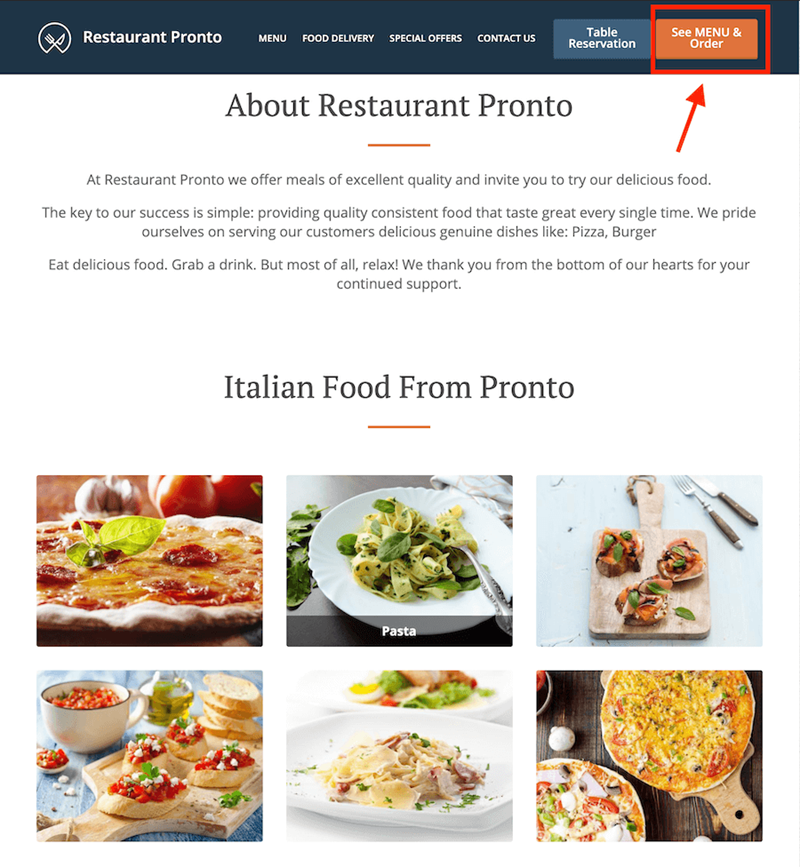
As you can see, the button is not just sticky, but it’s also instantly visible. You should make it stand out by using a color that pops on a darker background and by giving it the space it needs. Don’t add it in a crowded place or surround it with text or other buttons. It will lose its impact and importance.
Moreover, don’t be afraid to make it slightly more prominent than other buttons on your website. As we’ve said before, this is a crucial part of food ordering websites.
To make the order online button stand out, you must also factor in color. Use a color that will pop against the background for maximum effect. Stay away from muted and neutral tones and go for bold ones. For example, a red button on a black background.
The call to action on your order online button is also critical. While there are many calls to action on websites that persuade people to take different options (check out the restaurant interior or the restaurant’s origin story), the one for the ordering button is the most important because it generates sales.
The text should be action-oriented and persuade clients to order from your restaurant online. The button should also clearly state what it does and where it will take the customer.
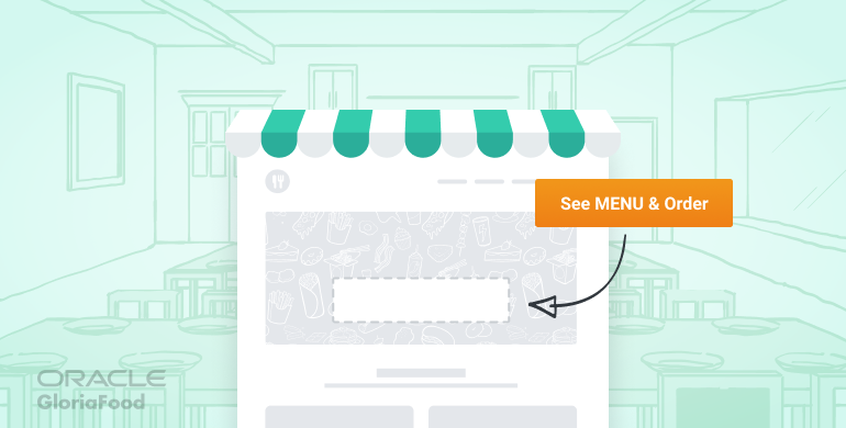
If they click on it and are surprised by the result, you’re doing it wrong. Add a text like “Order Online” or “See Menu & Order” and link the button to your online order form.
Our online food ordering software provides an order online button that is easy to install and customize. You can add it to your restaurant website in just a few clicks. It’s just a matter of copying and pasting a call to action button HTML code to your site.
One of the key benefits of our online ordering system is we’ve created it with a sales mindset. The look and placement of the button create a “tunnel vision” that focuses on the ordering experience. Moreover, we have a separate mobile version that triggers itself automatically to provide a mobile-optimized experience that will help you sell more food online.
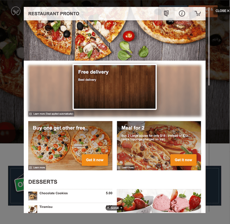
Our order online button doesn’t redirect customers to a different URL. Sending users to another page might lead to a conversion drop of up to 30%. Instead, we open a pop-up that encourages the customer to focus on the ordering experience without any distractions.
We’ve also made our online ordering button compatible with most website builders. Here are instructions and recommendations on how to add the button if you use one of these website builders:
But what if I want to design a button of my own, you might ask? With our restaurant ordering system software, you can. You can customize the button by changing its color, font, size, or even style to make it fit with your other website elements. You can read more about how to customize the online ordering button or check out our dedicated video below:
If you feel like your current website is too crowded and not optimized for sales, we recommend trying our sales optimized website service. We can generate a restaurant website for you that is both sales and SEO optimized without any effort on your part. Moreover, the online ordering button is included. Learn more about this service here.
Let us do the work for you and you can just sit back and enjoy the benefits of a restaurant website designed to convert visitors into clients with a strong and immediately visible order online button.
Check out this video to see how easy and fast it is to generate a restaurant website using our online ordering system:
Don’t stress over your restaurant website, let us generate one for you
The online ordering and table reservation system is included
Wrap up
This is everything you need to know about how to set up online ordering on your restaurant website by adding an order online button. Our white-label online ordering solution is designed to make it easy for you to boost sales online without breaking a sweat. You don’t need any technical knowledge for this.
If you have questions about adding the order online button to your website or you need help doing it, don’t hesitate to write to us.
- Why does it matter so much where you place the order online button?
- Where should you add the order online button? (Visual Instructions)
- How to add the order online button on your restaurant website
- Sell more by adding our order online button on your website
- Customizing your order online button
- Wrap up
