- Core benefits of one-page restaurant websites
- 1. Create a connection with your target audience
- 2. Offer an enhanced user experience
- 3. Sell more food
- 4. Speed up your website’s loading
- 5. Stand out from the competition
- 6. Get more conversions & less traffic loss
- 7. Benefit from an easier website analysis
- How to get the best one-page restaurant website
- Final words
One of the most successful ways to inform customers about your business, strengthen your brand, and create brand visibility is through your restaurant website.
So, how can you persuade your potential customers to order from you? One way is to use one-page restaurant websites.
Nobody has time to wade through tons of pages to find what they need, especially when they’re hungry, and all they want is to find a restaurant with a quick online ordering process and quick delivery. That’s why a single restaurant website page can prove useful.
Core benefits of one-page restaurant websites
Usually, the average user barely spends 15 seconds on a webpage. o, you should make the most of one-page restaurant websites, which is the hottest trend right now – because they show your customers everything they need to know, at a glance.
There are five essential features to any successful restaurant website. Here are the restaurant website must-haves:
- About Us section
- Responsive restaurant menu with mouth-watering food images
- Special Offers
- Contact Information section
- Opening Hours & Address
Among the advantages of the one-page website is that it allows you to summarize all of this information on a single page, which makes managing this type of website all the easier.
Let’s take a look at the other benefits of using such a website for your restaurant business:
1. Create a connection with your target audience
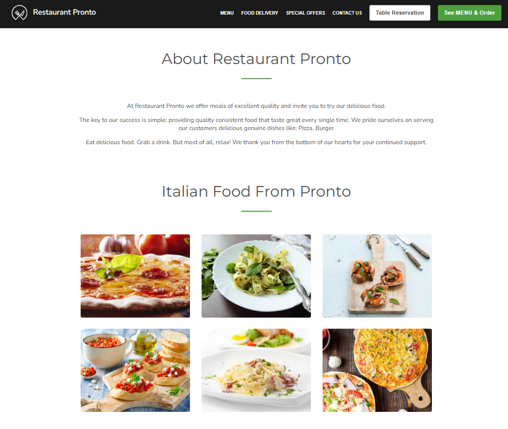
One page restaurant websites allow simple storytelling of the brand while enabling easy navigation. The more pages a website has, the more complicated it becomes for clients to find what they are looking for.
Whereas, with one-page restaurant websites, one can scroll through and get all the information they need, including menu options, special hours & timings at a glance.
2. Offer an enhanced user experience
Now, there is no doubt that cramming too much information on one page might mess up the design of your website. It could impact user engagement, too, if the design is not thought through.
However, if you structure your one-page web design efficiently, you get to control the way your visitors would normally get the information from a multi-page website.
Visitors tend to jump from one page to another and as a result, they tend to miss out on important information. By placing the relevant information on a single page, you can direct the website visitors towards your call to action buttons: the menu and table reservation system.
3. Sell more food
Compared to multi-page restaurant websites, the design & the development of a single-page restaurant website are faster & cheaper, too. Plus, managing a one-page website requires less time and effort on your part.
Also, there is no need for complex maintenance. You will not need additional expert IT support, either. By using the GloriaFood restaurant website generator, you will be able to do this yourself, without the need to write a single string of code.
In addition, our web design is concentrated on providing visitors with an immersive and consistent user experience that boosts conversion rates and engagement.
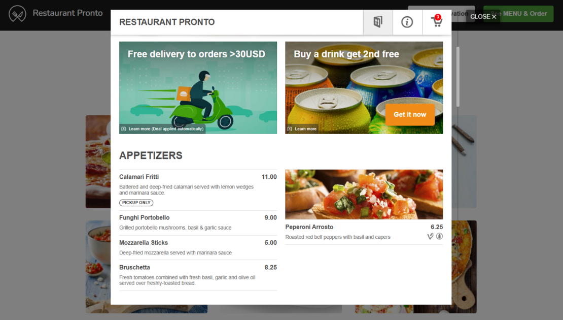
Due to this enhanced restaurant website UX (user experience), your customers will enjoy the oversimplified online ordering process and you get to receive more online orders.
Want a high performing sales optimized restaurant website?
Pricing starts as low as $9/month
4. Speed up your website’s loading
One page restaurant websites oad much faster than the usual restaurant websites, so this improves the website experience of your customers. The ideal loading time of a restaurant website tends to be 0.4 seconds. Normally, a customer accepts a loading time of up to 2 seconds. If it takes longer, the customer will leave the page.
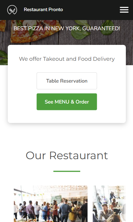
And here’s another important piece of information: according to Google, more than half of all web traffic comes from mobile devices. So, your website also needs to be mobile responsive, and that is easier to be done with a one-page restaurant website.
5. Stand out from the competition
There are many other food businesses in your area, and you must do all you can to outshine them and persuade potential customers to choose your restaurant over theirs.
Single restaurant websites are relatively new & would make your website stand out among the rest. Present your menu and food in an appealing way and this can help you increase your profit.
6. Get more conversions & less traffic loss
The simple design of the restaurant website makes the conversion of orders much faster and easier. Furthermore, the increased conversion rate is also impacted by the loading time of the site. As stated earlier, the simpler the design, the shorter the loading time. Win-win
A good one-page restaurant website will lead the visitor immediately to the order button, so they can start placing their order fast and easily, with no time wasted trying to find the menu on a big and complicated site.
7. Benefit from an easier website analysis
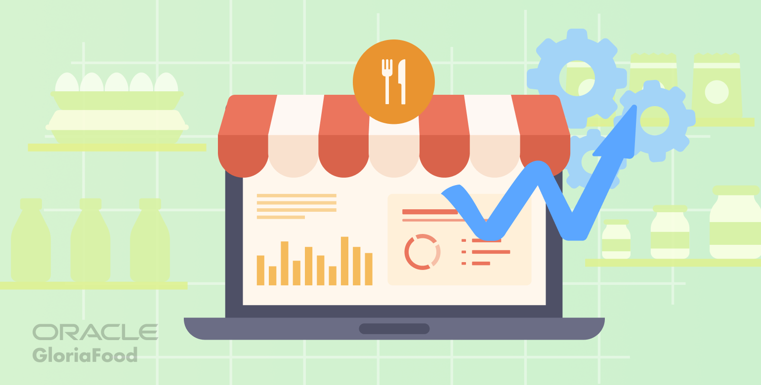
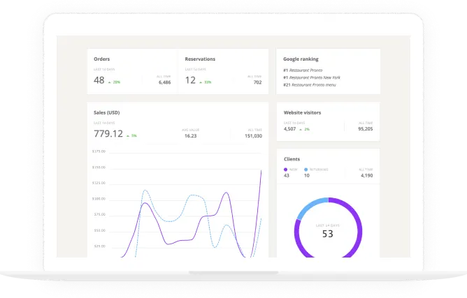
One page restaurant websites feature a simpler design which is far more manageable and easier to analyze. You could track website results with tools such as Google Analytics or Google Tag Manager. Or you could use the free GloriaFood online ordering system that also provides you with highly useful analytics and recommendations.
For example, you can identify your Google ranking, the number of online visits, the number of online orders, and many other valuable restaurant data statistics.
How to get the best one-page restaurant website
Now that you know what the benefits are, it is time to get to work. The good news is that generating one-page restaurant websites is easier than you have imagined. No need to learn to code or contact developers and invest a lot of your valuable time and money.
You can get a sales and SEO-optimized website with GloriaFood for less than the price of a pizza a month. Here is what you must do:
- Create an account on GloriaFood;
- Make an irresistible menu with the help of our wizard;
- Go to Setup -> Publishing -> Sales-optimized website to generate your website.
In a few minutes, you will get a website that not only ranks you high in Google searches but also helps you sell more of your food because it has an integrated online ordering system that makes ordering food a breeze.
If you are a more visual learner, you can find video instructions here for generating a one-page restaurant website:
Do you want to increase your online presence and get more clients?
Get a sales optimized website that will turn visitors into customers
Final Thoughts
One-page restaurant websites are slowly becoming the norm as the many benefits make them irresistible for both restaurant owners and customers.
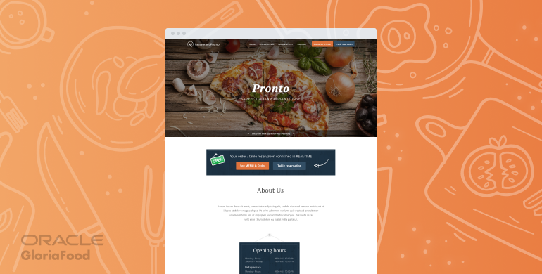
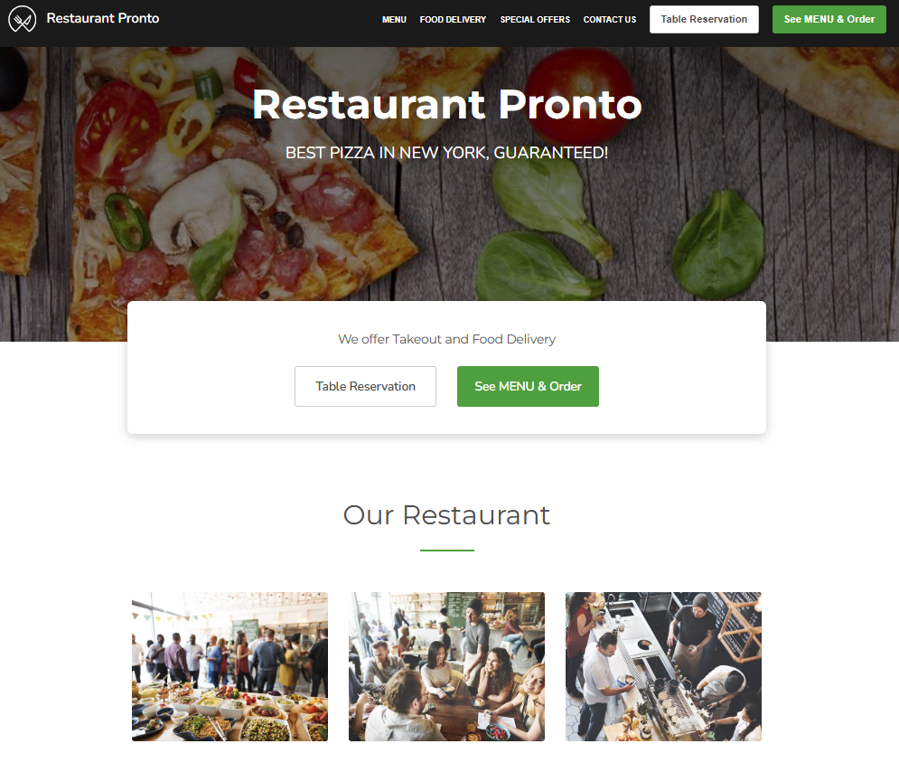
If you have a website for your restaurant already, try this format, and you will see the difference. If not, there is no need to look at any other web design. Check out this restaurant website demo for yourself –https://pronto-wp.com/ that was created using the GloriaFood Restaurant template.
- Core benefits of one-page restaurant websites
- 1. Create a connection with your target audience
- 2. Offer an enhanced user experience
- 3. Sell more food
- 4. Speed up your website’s loading
- 5. Stand out from the competition
- 6. Get more conversions & less traffic loss
- 7. Benefit from an easier website analysis
- How to get the best one-page restaurant website
- Final words
